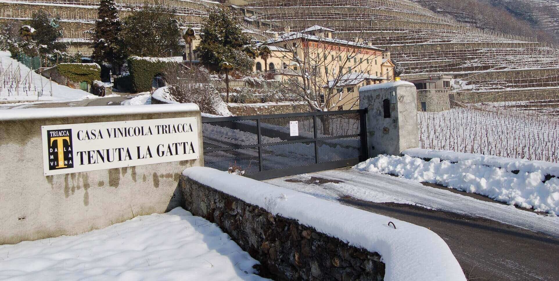
Founded in 1897, Casa Vinicola Triacca, now in its fifth generation, is an interesting tale that is still writing its own happy ending, made up of work and people, flavors and aromas.
Throughout its more than 100-year history, the winery has continuously made numerous technical innovations both in the work of its vineyards and in its transformation in the cellar. This has allowed it, with the classic and elegant style that has always accompanied it, to distinguish itself with a well-defined aesthetic taste and to give soul and character to its products.
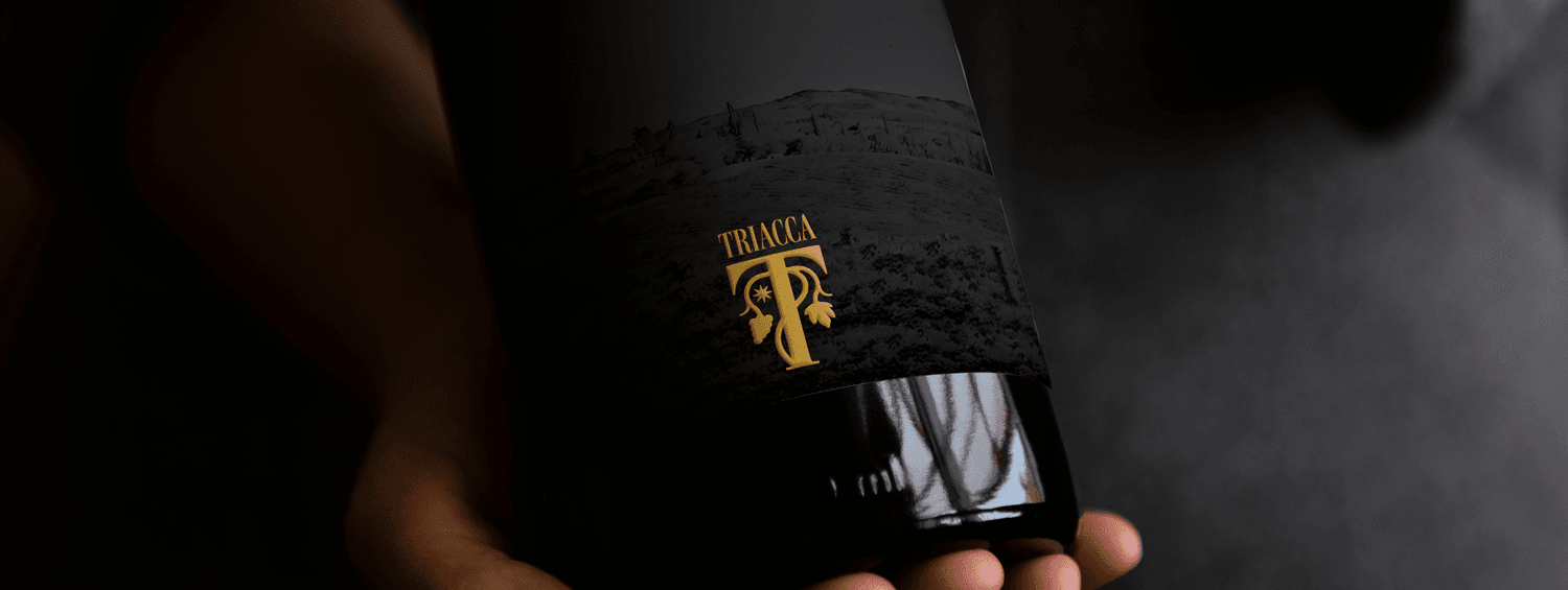
The same innovative force has also pushed Triacca to renew its visual identity, its image, its logo.
THE CREATIVE PROCESS
To rework and work on Triacca’s new visual identity, we dug deep into its rich history, among historical heraldry, brands, labels and advertisements of the past. An in-depth iconographic and visual research allowed to collect significant materials with a strong communicative impact.
Therefore, for the main aesthetic inspiration, “a return to the future” was opted for. A process that started from the company’s desire to rework of one of the richest and most interesting visualizations of the Triacca brand, figurative, rich, explicit.
NATURAL EVOLUTION
The process of re-designing the Triacca identity started from the analysis of the current logo in its forms, which allowed us to bring a more contemporary, cleaner and clearer graphic level to the new logo, but without disrupting the structure and visual essence of the brand. The new logo gathers the aesthetic identity of the past and carries it into the future.
The “T” monogram is lightened and projected in shape, upward, enveloping and solid, contemporary in line and dynamic in form.
The vine shoot, an expression and revision of the historical Triacca iconography, moves softly, between the lines, and is the main visual protagonist of the new Logo, an iconic element of the future and a firm link with the roots of the Brand.
Enriching the meaning of the Logo’s main illustration is a star, taken from one of the richest historical heraldry of the Triacca family. The star is the central figure of the coat of arms and represents a wish for a “bright future” for the Triacca lineage.
The pay-off “Dalla Mia Vigna” (From My Vineyard) has always told the whole philosophy of Triacca. A focal point that defines the way of working and thinking of the entire company, able to convey the passion and the bond between the company itself and its customers, without barriers. In the new design it takes a prominent position within the logo, which increases its visibility.
A LOOK TO THE FUTURE WITH THE PASSION AND QUALITY OF ALWAYS
The restyle of the Triacca brand has a very specific purpose: to improve the effectiveness of all communication, offline and online, thanks to a recognizable logo that can be declined in multiple areas. All without distorting or distorting the shared idea of how the company should be, while respecting the fundamental elements that characterize the family’s thinking and history.
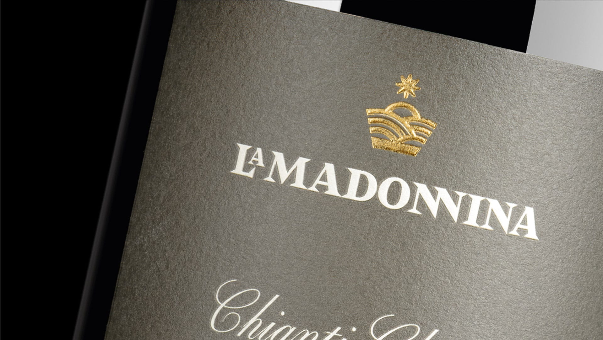
Triacca has always relied on the use of its name as a banner of guarantee on its products. The new logo will take on this function by uniting and linking products and territories that are very different in nature, characteristics and history, such as Valtellina and Tuscany.

