ELEGANCE IN STEP WITH THE TIMES
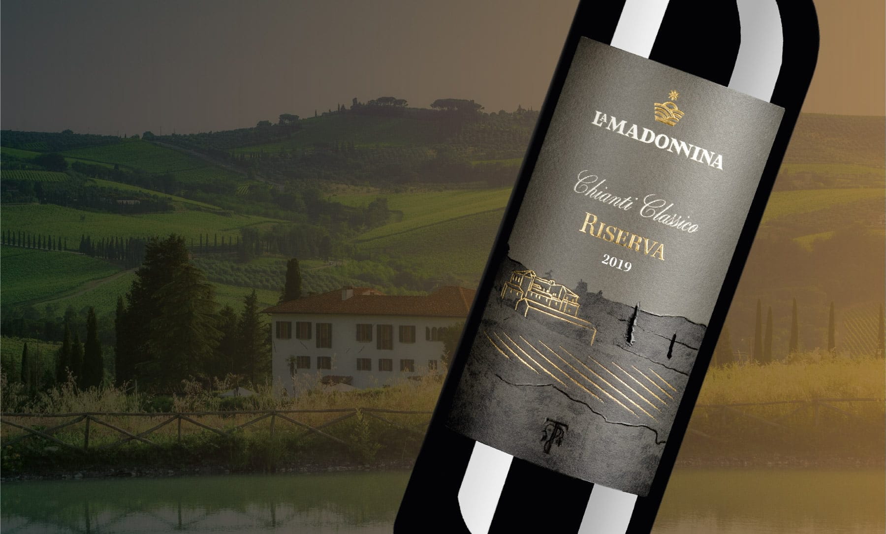
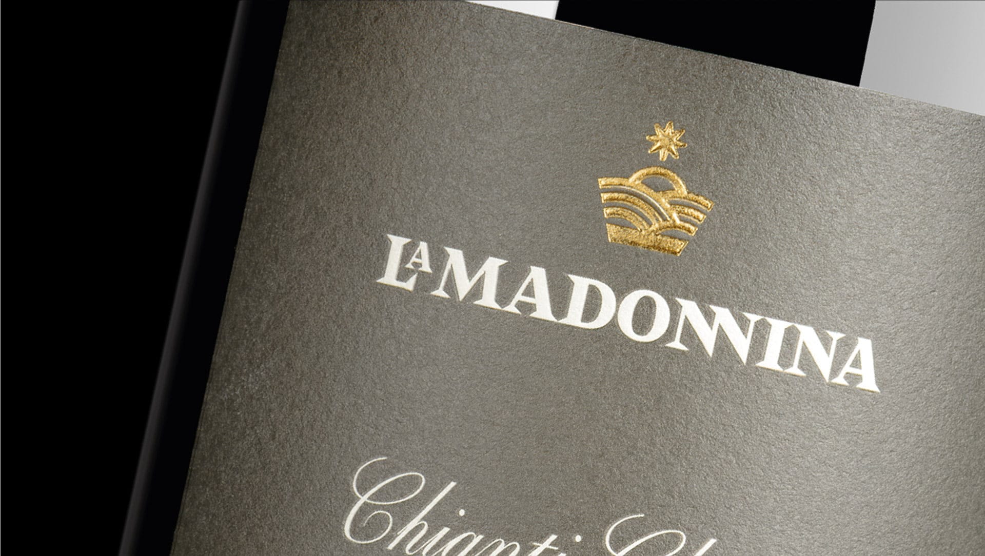
Just as with the new La Madonnina logo, strongly identifiable thanks to the central crown and the style that respects past visual interpretations of La Madonnina, the new label for our Riserva aims to make the product unmistakable.
Through the renewed design celebrating the landscape of the La Madonnina Estate, including the characteristic hills of Chianti, new meanings emerge that further enhance its message, adding greater prestige to the original. Thanks to the adopted new style, the improvements made, and the distinctive quality of the paper and finishes used, the perceived value of the product also increases.
CONTINUITY WITH THE PAST
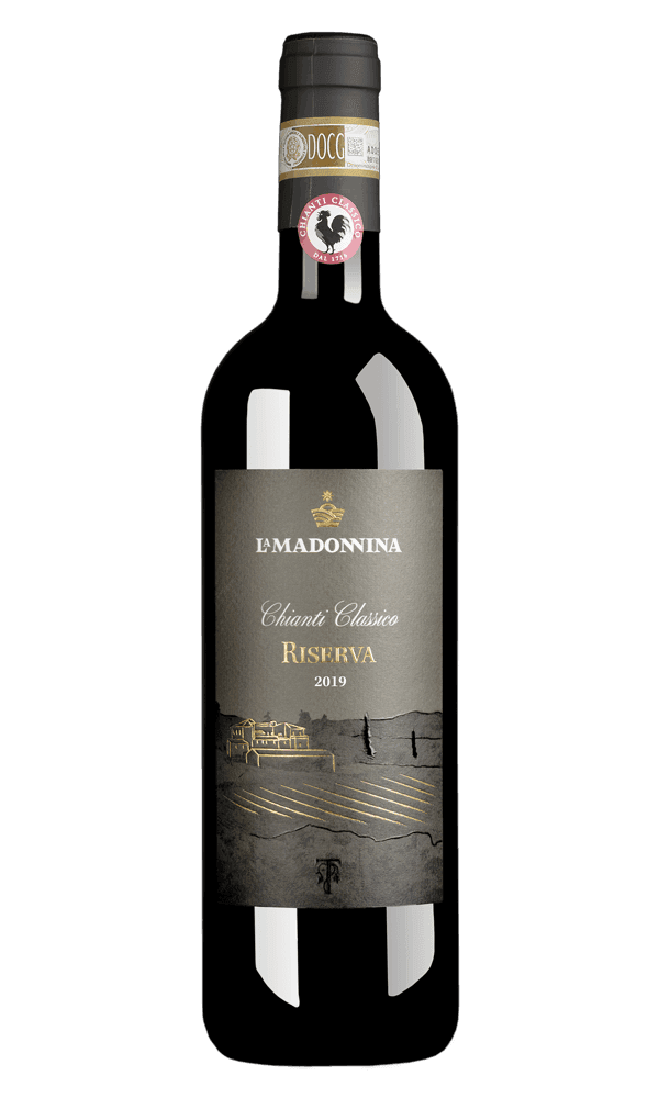
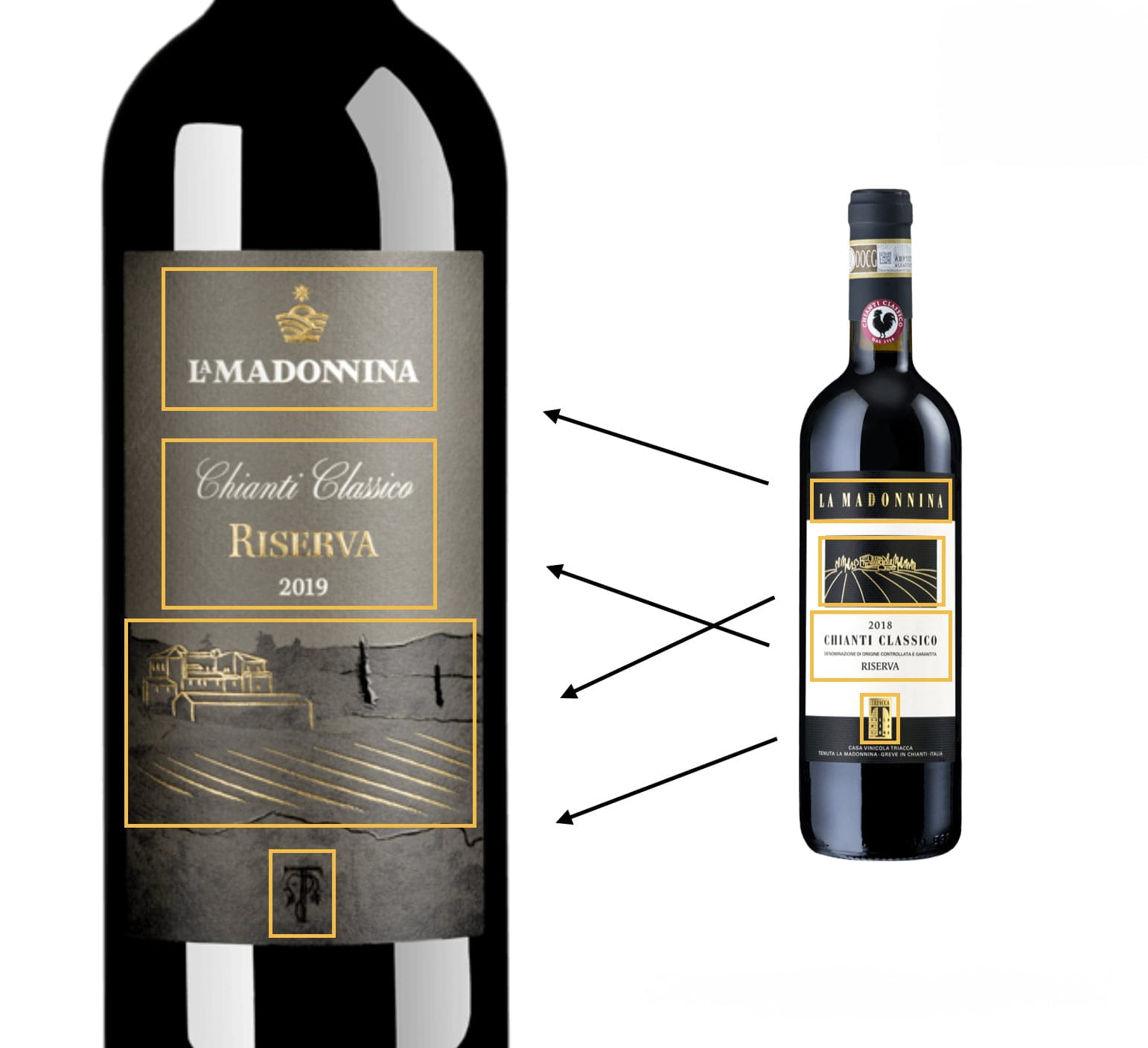
To maintain the current recognizability of the product, it has been decided to respect the same content blocks present in the most recent version of the label:
- The new La Madonnina logo gains more importance, becoming predominant compared to the past.
- The product name “Riserva” now stands out thanks to its larger size and embossed golden finish.
- The illustration of the Estate maintains the predominance of the label but with a more artistic and refined style.
- The Triacca monogram is in the same position but with a different graphic impact: it captures the user’s attention thanks to the appropriate finishes, without conflicting with the La Madonnina brand.
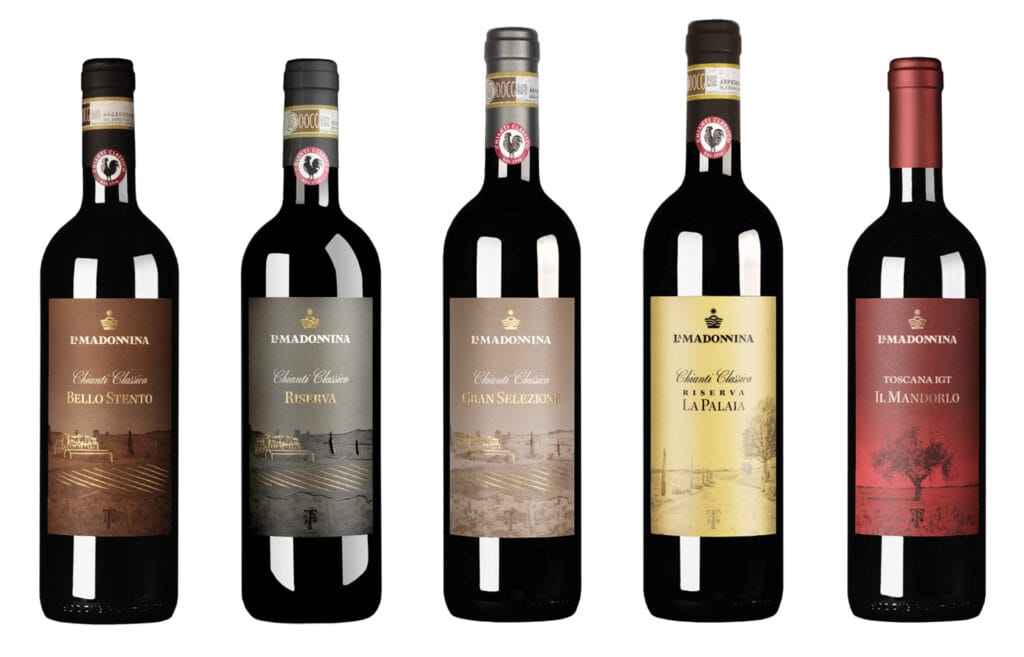
THE COMPLETE LINE
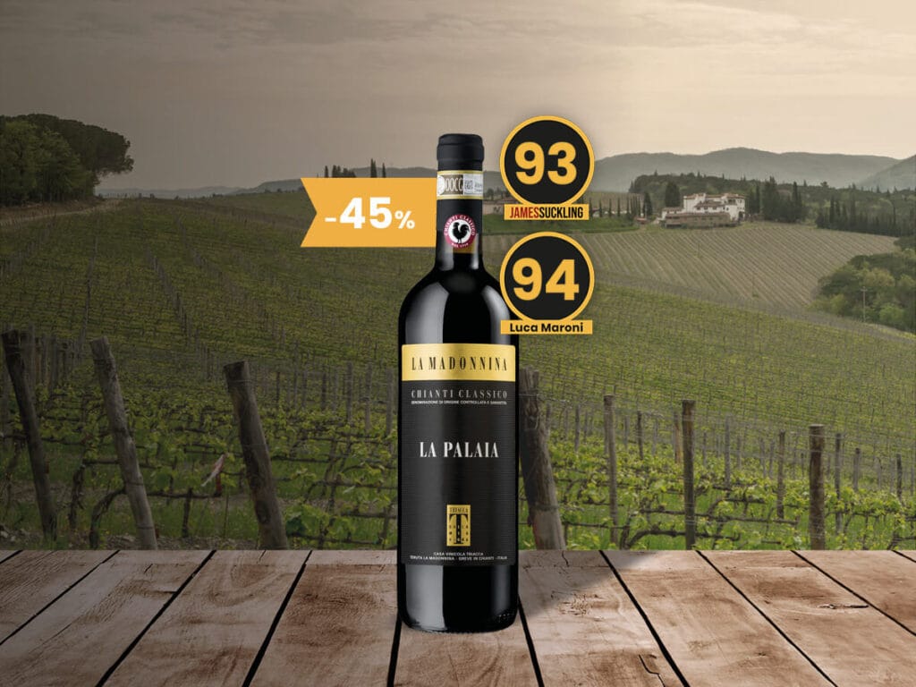
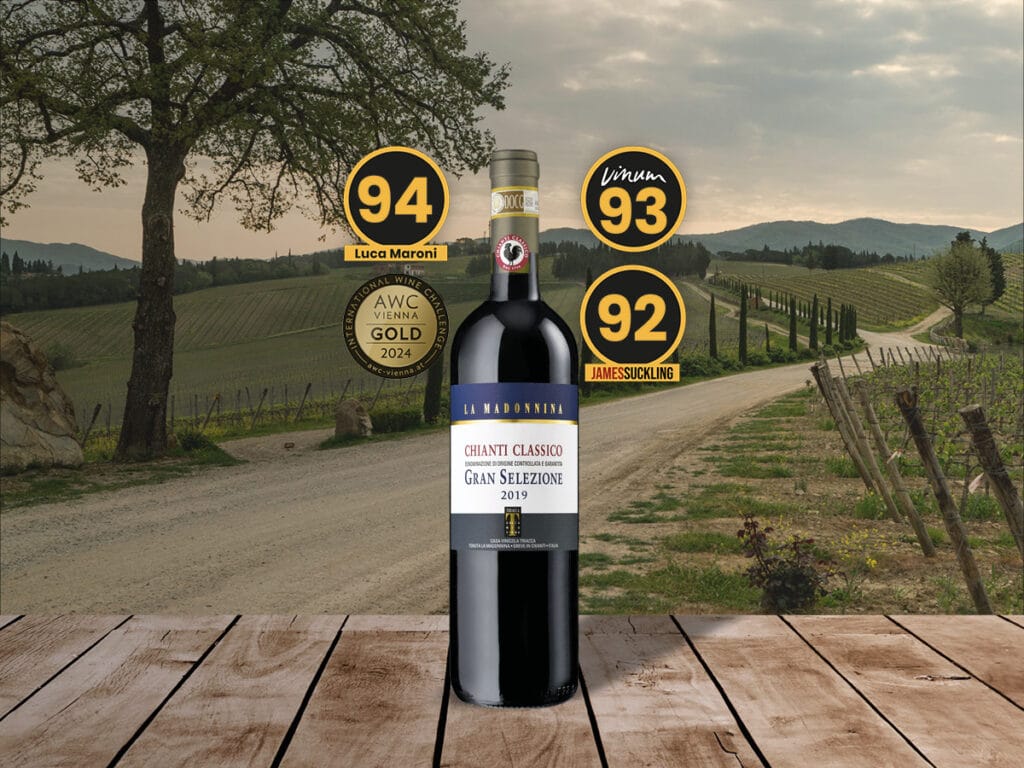
All labels in the line will be coordinated for aesthetic taste, finishes, and color scheme, thus achieving a recognizable and well-defined overall image.
